
When it comes to design, we (that's you and us together - after discussion) can either start your website design using a template (of which we have hundreds) or with a totally blank screen to which we can add anything we like.
Which of these options we go for will primarily be dictated by budget; if you are starting out with us by having the basic 3-page website (e.g. Home, About Us, Contact Us) for our lowest fee (currently £400 @ Summer 2025) then it will have to be a template-based site because there is not enough budget to start to design from scratch. This is not a bad thing, though; even clients who pay significantly more often opt for a template anyway because they like the look and feel of one of the many site templates we offer. Of course, even on the basic fee, we will still fully customise the template to your taste in terms of colours, fonts, images, etc., but the template will already determine the basic layout of each page.
As there are hundreds of templates, the original question - "How should homepage/landing page images best be combined with text for maximum impact?" - still stands because we have lots of templates that would apply to each category, and many of these templates allow for a full-screen image on the homepage as the site intro. If we are starting from scratch, we can obviously do whatever a computer or mobile phone screen is capable of displaying, which these days is quite a lot!
So, which category should we go for? And how conservative or bold should we be with your images and your text? How will we merge the impact of the images and text, and will we prioritise one over the other?
Let's have a look at a few examples and then you can see what your thoughts are on each of them.
For the sake of impact we will use flashing arrows on each page to draw attention to certain features. On the first screen (just below) you can hover the mouse over the arrows (on desktop) to reveal a message, but this technique proves inconsistent across display devices as hover obviously doesn't work on a mobile (as there's no mouse to hover with) so the text may be set to already showing.
Also, due to the limited width of a mobile screen, the full effect of this part of the presentation can't be appreciated fully on mobile so is best viewed on desktop. This part then, has the additional advantage of demonstrating how the desktop and mobile versions of a website have to be slightly different sometimes and if you can look at this on both devices at the same time you will get a better understanding of how a web designer has to factor in the difference between a wide display (desktop) and a narrow display (mobile).
We will use black page separators with jump to next slide tools, like the one below - eagerly moving up and down to entice your mouse click or finger press!
Example 1 of text over images

Use a font that matches your chosen style - this one is called "Simonetta" and is named after a famous lady of the Italian Renaissance.
Plain white text here is a poor choice as it is difficult to read against the background.
If you want your background to really stand out and take the whole screen then use a hamburger (mobile) menu on the desktop instead of a normal linear menu at the top.
Use a font that matches your chosen style - this one is called "Simonetta" and is named after a famous lady of the Italian Renaissance.
Adding a background to the text makes it easier to read but somewhat ruins the effect of the background image, so with this type of background it's not a great solution.
Example 2 of text over images

It might be better to darken the whole background so the text is easier to read...
...or maybe lighten the whole background and change the font colour so the text is easier to read. But does this really work - not well, we'd say.
Example 3 of text over images
Or maybe we choose an area of the image where not much is happening and make just that particular area darker so the text is more legible? And by making this area semi-transparent we still see the image below. What do you think?
Hopefully you found that brief consideration of image and text interaction interesting. These are the types of dilemma a professional web designer will consider when creating your website. The final outcome will almost always be subjective as one solution might look better to person A and another might look better to person B, but more often than not, a majority (if not all) will reject solutions that don't make sense - for example, the text is just simply unreadable.
Let's move on now and have a look at something different.

If you don't absolutely need a very particular image, it can make sense to choose images (or videos) that have naturally blank, dark or light areas in them - like this one. Then there's no need to put a backing behind the text and it looks just fine.
It also makes sense to choose images and/or videos that have some connection to what you're doing, for example....

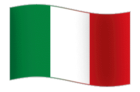

What we have done here is to take the initial video background of Florence (Firenze in Italian) and darken it by 20% using a black underlay. We have then used the exact colours of the Italian flag for the main text and a neutral light grey for the opening times and added a black stroke around all of the letters to make them just that bit easier to see - it's barely noticeable when you read it but makes quite a difference to the text clarity. Next, we have added an historical Florentine postage stamp to act as type of logo (this fictional restaurant has no logo of its own) and we have put an aminated Italian flag (called a GIF) and a fleur-de-lis (a traditional motif of Florence) on the top right to balance the screen.
Now, as we continue with this discussion, do keep in mind that the examples on theses pages are not real or even mock-ups of restaurant homepages (none of them would actually pass muster as real designs) - we are just looking at one aspect here, i.e. how colour and text intermingle - none of the following examples represent what a real restaurant homepage might look like.
So, that said, what do you think about this as the homepage/landing page? Does it look great, just OK or does it look old fashioned - slightly amateurish maybe? What type of audience would this attract - older couples, young professionals, lovers, families with children, business diners?
Do you get the impression that this restaurant is formal or informal, expensive or inexpensive, elegant or cosy, snobbish or friendly, cordon bleu or home-style cooking?
If you were on a business trip to the town where this restaurant was situated and someone had told you about it, would this homepage make you more or less likely to want to visit it? Think why?
When you stop and think about it, it's really quite amazing what messages are contained in one simple website screen!
These are the kind of things a professional web designer has to take account of (as do you as the business owner) - who are you trying to attract?
Il Gusto di Firenze
Ristorante Italiano
Cucina Autentica di Firenze e della Toscana
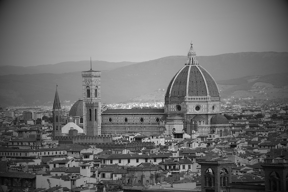
If we change the same image to black & white and make it static, and change the font and colour scheme (no Italian flag - too colourful!) then we get a completely different impression. The continued use of Italian without English in the header section also adds to a somewhat higher level of sophistication. Just a few changes really, and yet a totally new feel to our fictional restaurant. As a matter of interest to yourself, how does this homepage compare to the previous one?
Is the restaurant now:
-
more formal or more informal?
-
more expensive or more inexpensive?
-
more elegant or more cosy?
-
more snobbish or more friendly?
-
more cordon bleu or more home-style cooking?
Or does it make no difference to you? What is your new impression of it?

The other consideration for any homepage is whether once you've decided on one you keep that forever (or a long time) or do you change it (like Google changes it's search box) for special occasions, e.g. Valentines Day - a very high profit evening for those restaurants playing the romantic card!
Anyway, we hope you've found some benefit from this discussion and it's made things clearer in terms of how to present images and text. Let's move on, or we'll never get done.
Quick Links to each Section
As we said above, the presentation is best watched in order - it will make more sense that way. However, if you've already been through it once and want to re-watch a particular section then the links below will avoid you having to go through the whole thing again to get to the part you want to re-watch.
-
Part 1: What type or style of website do you actually need?
-
Part 2: What exactly do you want the website to achieve for you?
-
Part 3: How should homepage/landing page images best be combined with text for maximum impact?
-
Part 4: Why you must own (in your own name or in your company's name) your domain & email service, and have full admin access to your hosting.