


WebSmiths Presentation Part 1: What type of website do you actually need?
When we begin our discussions about your website, one of the first things we will need to consider is your landing page (or pages)... or not, as the case may be.
So, what Is a Landing Page?
A landing page is a standalone web page that a visitor arrives at after clicking on a specific link — often from a search engine, advert, email campaign, or social media post. While it can be the home page and sometimes is (in our case it is) in many cases it is a separate page created with a specific purpose in mind. It got the name "landing page" because it was the first page a visitor "landed" on when coming to a particular website.
A landing page is typically designed to focus attention on one clear message, goal, or call-to-action (CTA), such as:
-
“Sign up for our newsletter”
-
“Buy now”
-
“Book a free consultation”
-
“Download a brochure”
Our landing page (which is also our home page) is clearly focused on trying to get the visitor to book a call or video meeting with us - have you done that yet, by the way?
Difference Between a Home Page and a Landing Page
A homepage typically provides a general overview of a business, with multiple links and navigation options leading to various sections of the site. It serves all types of visitors and is a permanent part of the website’s structure.
In contrast, a landing page is usually designed with one focused purpose in mind. It usually contains minimal distractions, fewer links, and is tailored to a specific audience or campaign. Landing pages are often temporary, created for particular marketing efforts such as promotions, ads, or lead generation.
This page could be a landing page - it goes straight to a fireworks display which auto plays on the entire screen - the only additional elements are: 1) a discreet homepage link to let visitors leave the page without exiting the site; and, 2) a on/off sound button which appears slightly (2 seconds) past page-load, with an avatar, to draw attention to its presence.
This type of page is there to focus the visitor's attention and to make an impression!
Some websites have such "displays" and some don't. Some incorporate such things more subtlety, others are more bold. This website, for example, has a pretty animated homepage which would probably not be suited to an accountancy or law firm, unless it was a start up with no clients - more about matching your website to your business stage later (it's an interesting psychological concept, if nothing else).
So, as we can see, we need to decide what type of website you need before we start building it, and the type of website you need will depend largely on just two factors.

The type of website you need will depend, first of all, on your type of business, project, or group.
For example, if you're a solicitor or an accountant, a landing page with a fireworks display and a matching audio track (like this one) is very unlikely to be suitable.
But if your business involves arranging fireworks displays or outdoor events, then such an introduction:
-
might be eye-catching and different from the norm;
-
could encourage visitors to stay on your site to see what happens next;
-
and will set you apart from competitors with boring, static websites.
You see, when we take on a web design project, the first two questions we usually ask are:
"Who is your target audience?"
"What do you want the website to do for you?"
The answers might seem obvious at first — but they’re not always as straightforward as you think...
For example, will your target audience be willing to read all the text on a page like this?
There is lot of content on this page (because there needs to be - getting your website type RIGHT is crucial to its success or failure) but... and it's a big BUT - if you bore your audience they will leave and go somewhere else.
Now, in our case, if someone is potentially going to spend thousands of pounds getting a professional website made, we would expect them to have enough interest in the project to read a few pages of text and understand the issues involved. But, if you are selling something less expensive, less involved, then maybe a video presentation would be more effective?
The video below contains roughly the same information as the blue text above - what do you think in terms of which is better? And do you think that you are representative of your audience?
You might want to check your sound is on for this, as it contains audio.
Let's move on to a take a closer look at how different target audiences might effect the font choice and colour scheme - just as an example, as matching to target, as we call it, is far too big an area to cover fully here.


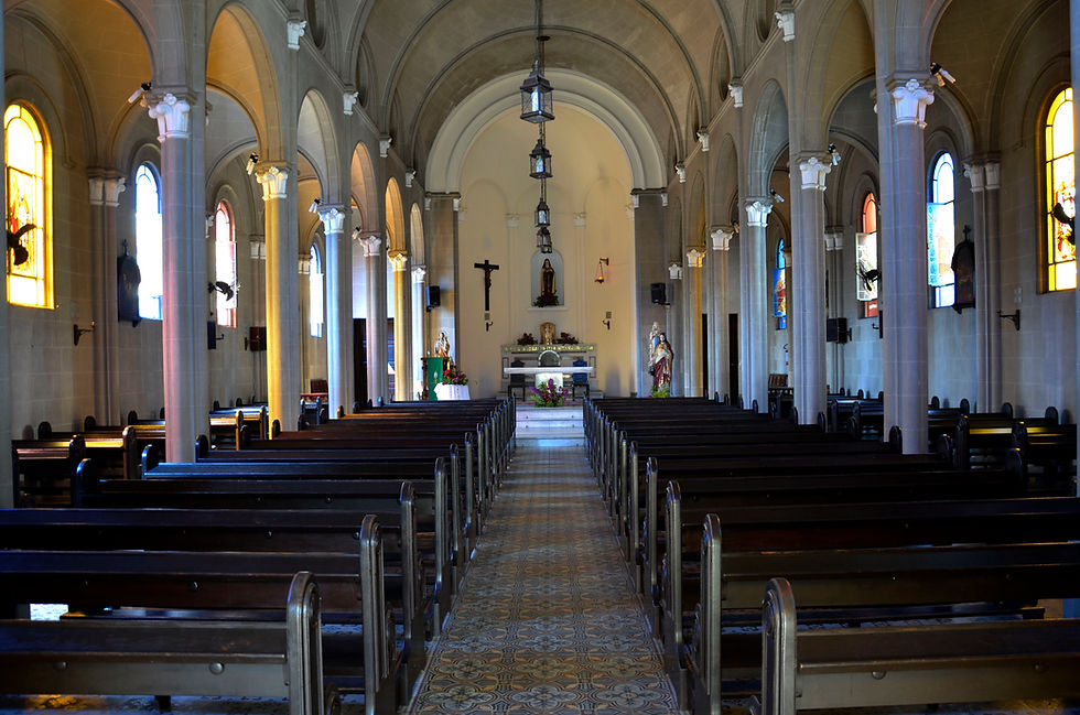
And the website of a Church would be different again.
Quick Links to each Section
As we said above, the presentation is best watched in order - it will make more sense that way. However, if you've already been through it once and want to re-watch a particular section then the links below will avoid you having to go through the whole thing again to get to the part you want to re-watch.
-
Part 1: What type or style of website do you actually need?
-
Part 2: What exactly do you want the website to achieve for you?
-
Part 3: How should homepage/landing page images best be combined with text for maximum impact?
-
Part 4: Why you must own (in your own name or in your company's name) your domain & email service, and have full admin access to your hosting.